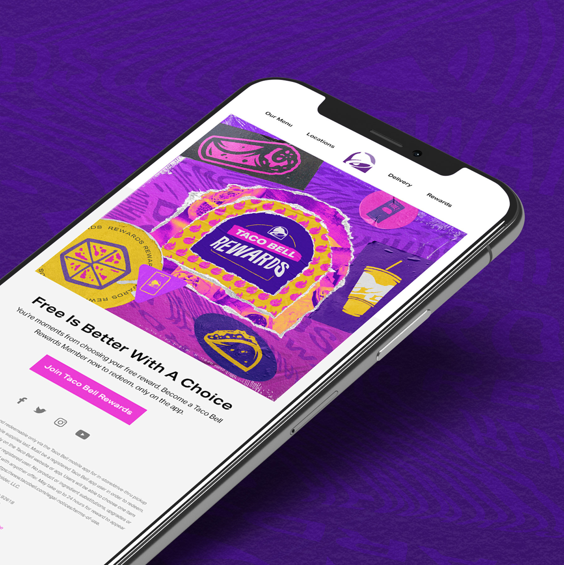
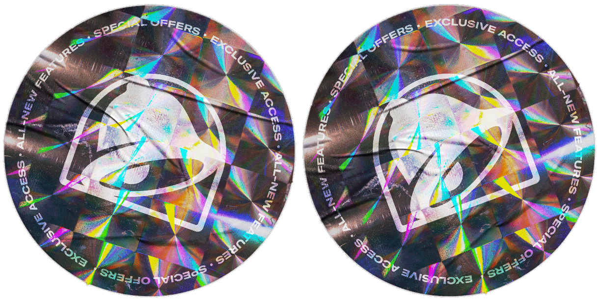
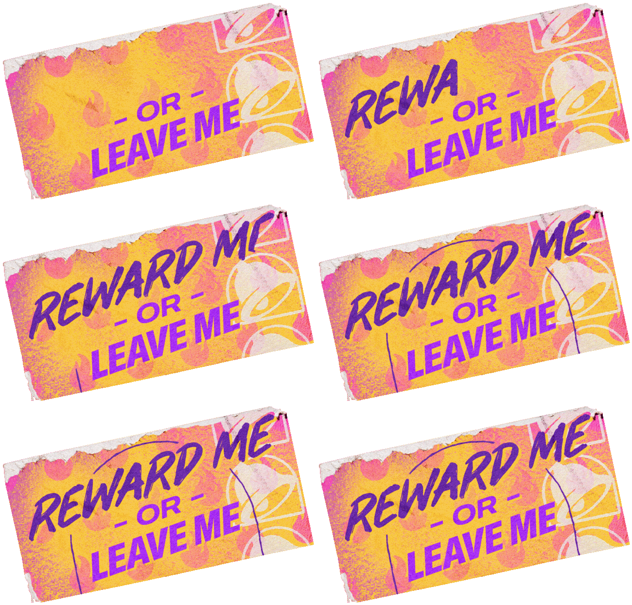
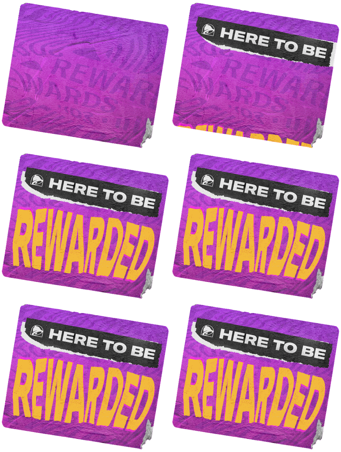
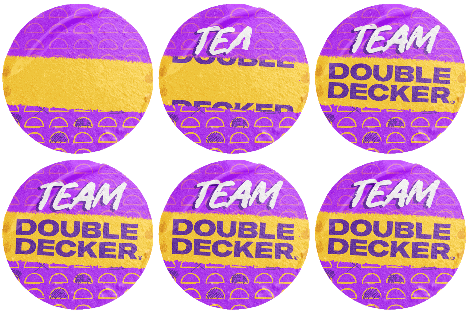
One of the first projects I led at Taco Bell was to revitalize the visual direction of their loyalty program. Until that point, Taco Bell Rewards did not have recognizable branding that visually distinguished it from other offers. The revamp of the rewards app was all about engaging with fans in an authentic and accessible way, making it feel more like a club rather than just another transactional program. This new look touched all aspects of the brand—app design, photography, social, in-store signage, Taco Bell Delivery, and more.
The loyalty refresh coincided with an opportunity for members to vote back past menu favorites and resulted in:
• 150k new loyalty members added in the first week
• 9.3% uptick in social engagement
• 20% of users voted 2+ times
• 20% of users voted 2+ times
Core Contributions: Concept development, creative direction, art direction, paid/organic social content, web/app design, logo design, print, and animation
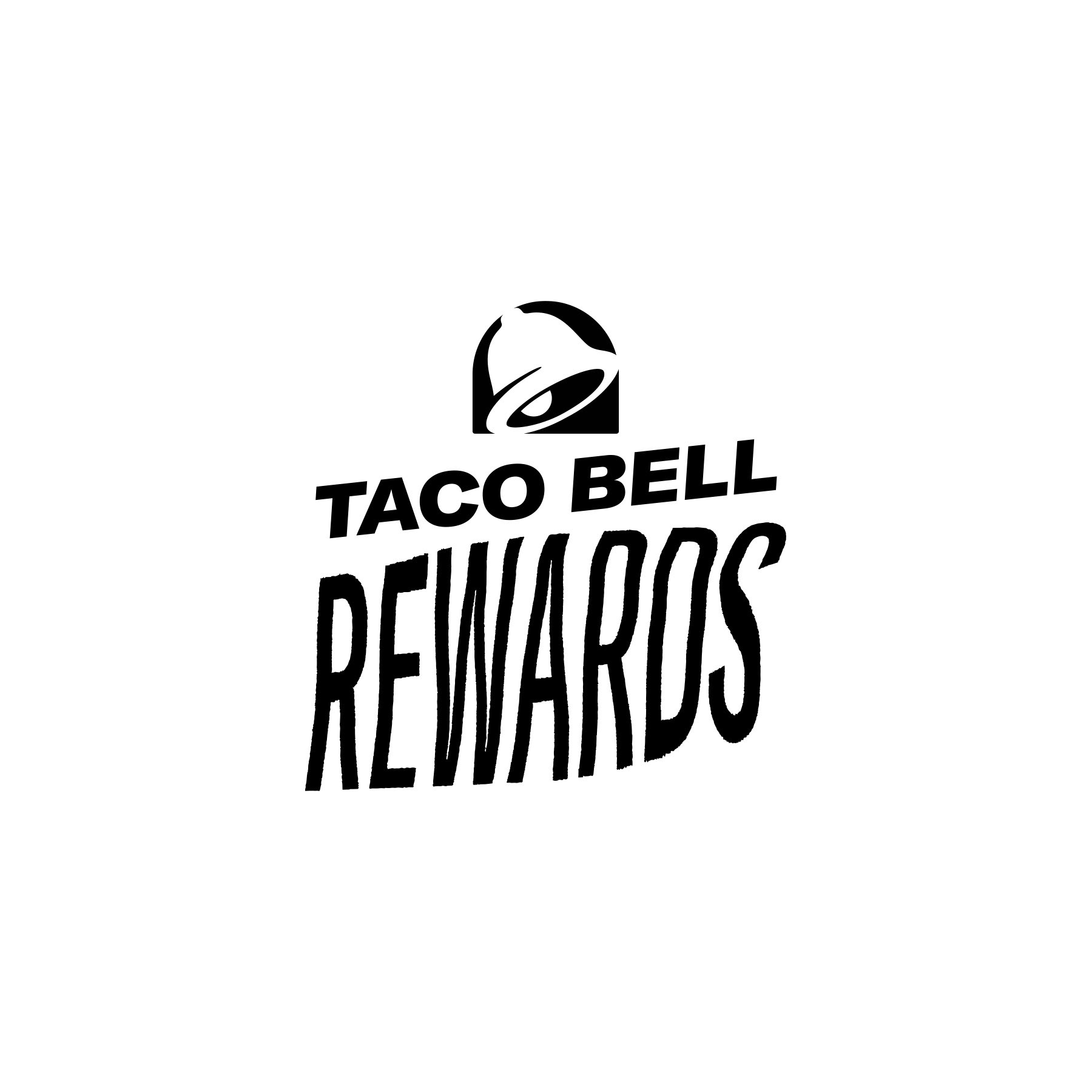
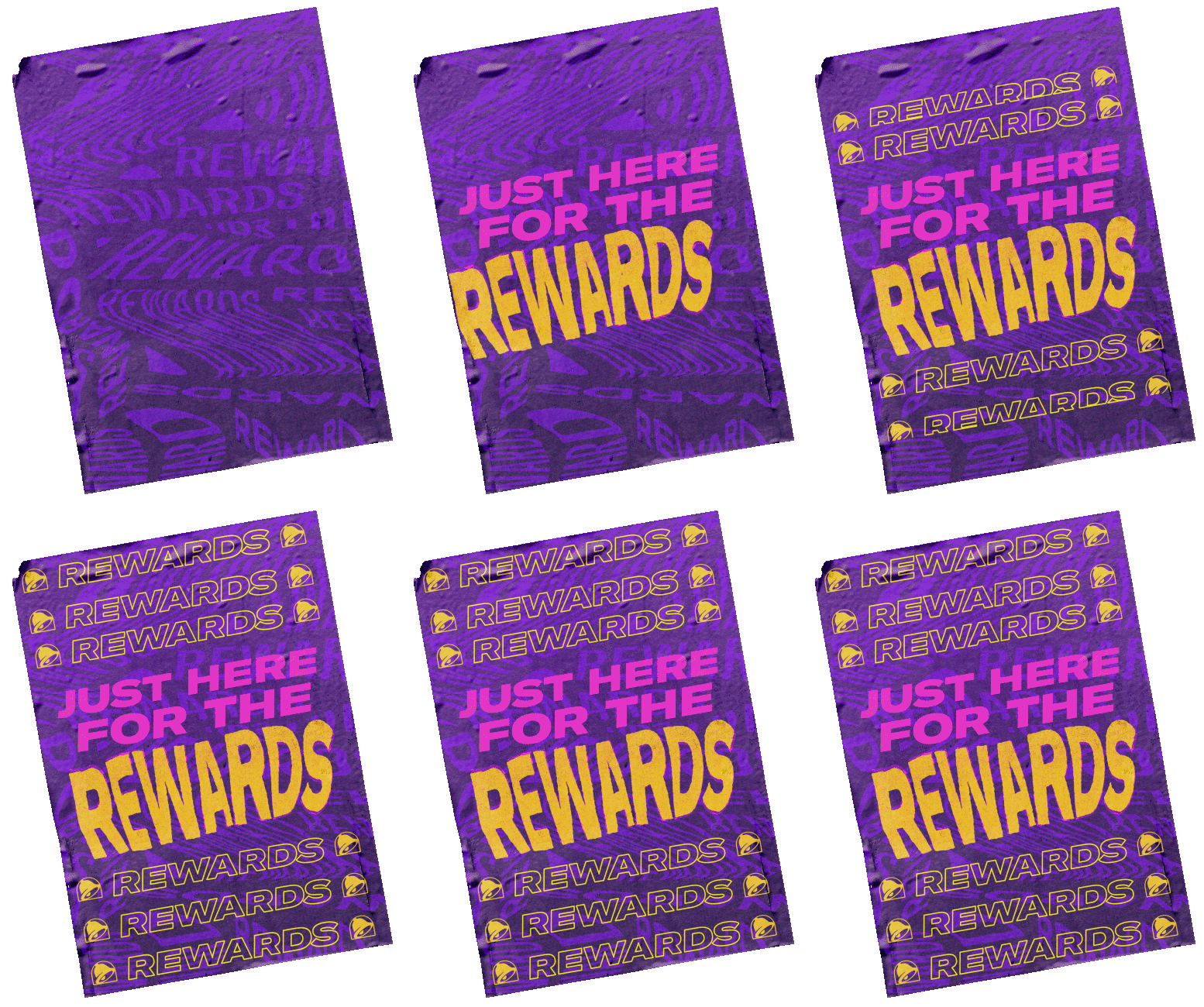
The new visual direction represents the fans—making fans feel known, feel included, and feel part of a community—with its organic creative elements such as warped typography and distorted graphics. Overall, the new Loyalty wordmark system symbolizes connection between fans and the rebellious nature of a program that seeks to push the boundaries.
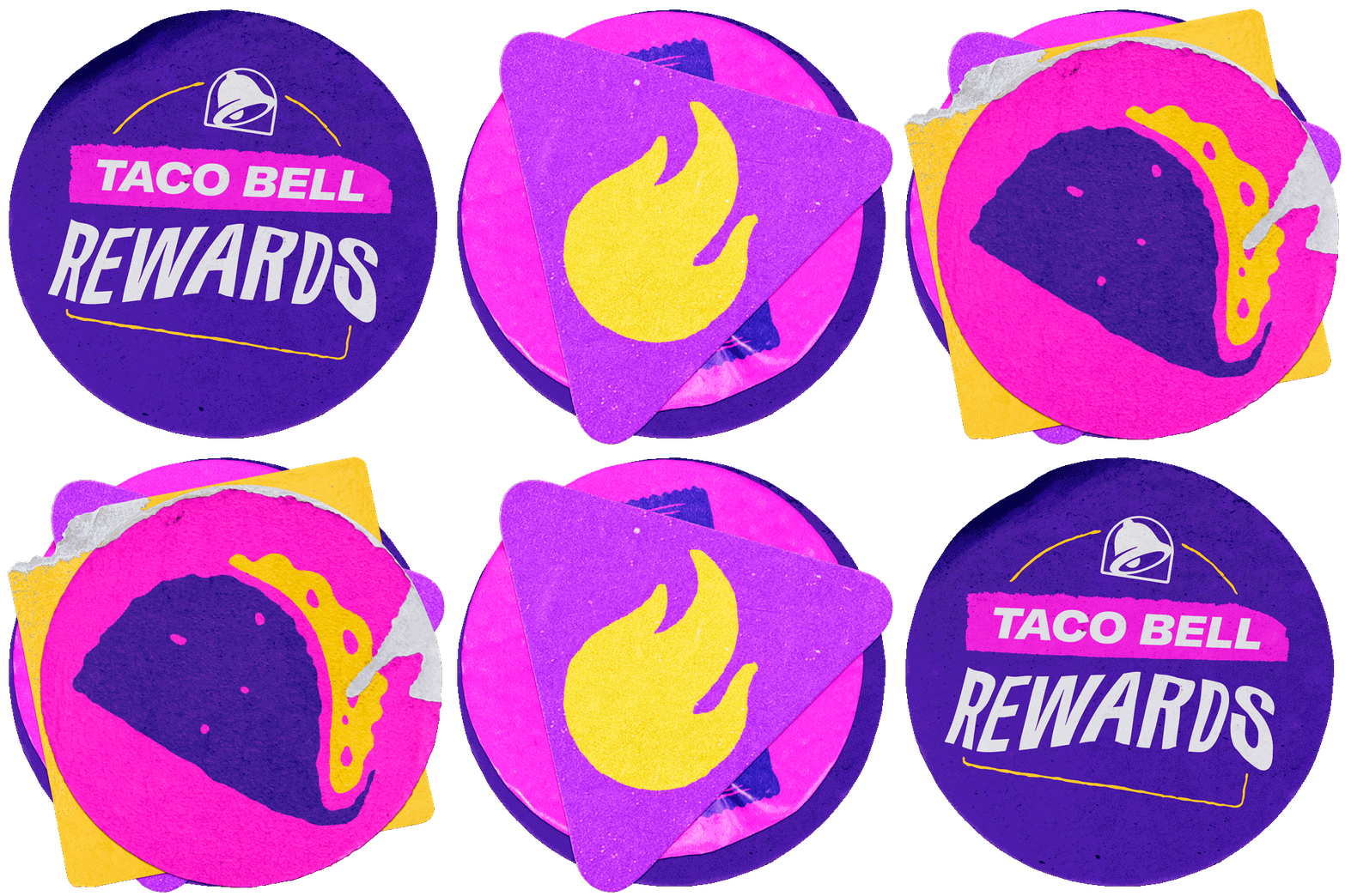
Though digital first, our Loyalty is born from the physical world that fans reside in, where they make decisions to affect the program’s trajectory, and where they’ll reap the real-world rewards they crave and deserve. Gen Z seeks out digital with an organic feel that evolves along with them. So, our intent was for the loyalty mark to have different versions. We would rotate between logo marks in this system for longevity, variation, and visual interest. This shift we see represents that anyone and everyone are represented as part of our cult. After all, it’s an ever-changing experience with fans at the forefront—made evident here in our fluid logo interpretations that changes as the program will.

